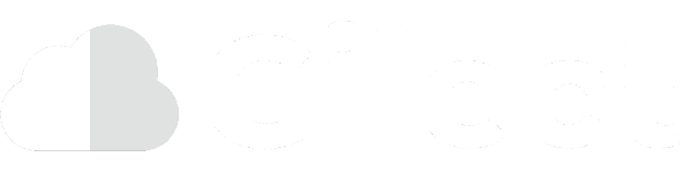

Our website looks a bit different now… spotted why? That’s correct, the Gilect logo changed! From a thin and round typeface to a bolder and more colorful one, here’s the thought process that went behind the new logo.


Consistencies
Color
The color scheme for our website is blue, with a bright green as the secondary color. Our new logo reflects these colors, with the cloud being split between light and dark green, and the text being blue.
Font
Our old logo’s font was Futura, a thin and very rounded font. This logo dates back to the days when Futura was the primary font for the Gilect website.

In early 2022, we rebranded our main website to its current style. This was then followed by an update to Gilect Central in June of 2022, where we began updating the look of Gilect Central to match our main website and blog. The update released in early August 2022.
One thing felt out of place: the logo. While our website was now using Montserrat, the logo was stuck with Futura. To match the look and feel of our website, the logo’s font was changed to Montserrat.
It’s Bolder
To stand out more, and match the headings of our website, the text was made much bolder. The Cloud icon was filled in to be a solid shape, with two tones of color. This allows it to be more recognizable as it scales down.
Size
The text was scaled up to be the same height as the Cloud icon. The letters are now roughly the same height as each other, and fit a single line, other than the dot of the “i”. There is also even spacing between the top and bottom of the lines.

On a Blue Background
We’ve kept the logo white when used on a colored background, such as the navbar of our website. The two-tone green logo is now white and light gray.


Let us know!
Let us know what you think of our new logo! You can contact us at [email protected]. We’re happy to hear from you!
Thank you for choosing Gilect!